Google is all in its way in testing its redesigned interface for its search app. You might be soon experiencing a new update of Google’s search app. On the Developers, I/O 2018 event Google announced a powerful new design system called “Material Theming”. It’s what many (including us) have been calling “Material Design 2” for several months.

There is no word on the new design it might take a while for the new design to roll out. The new design reported by 9to5Mac brings changes to the search bar and a new look for the feed that you see in the Google app. Some minor changes are also visible.
The new design is planned to come to all of Google’s services, apps, and products, including all of its Android apps, iOS apps, popular web apps like Gmail and Google Drive, and more.
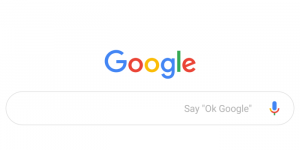
Starting from the search bar, Google is seen testing a more rounded (pill-shaped) search bar instead of a rectangular one. And there is also a slight change which includes a faint boundary without a shadow effect for a clean look. The Say”OK Google” text inside the search bar and the microphone icon remains the same and so does the ‘Google’ logo above it.
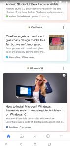
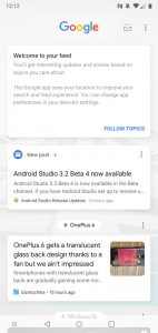
Google app began testing a new look for the Feed located to the left of home screens. The Google feed sport a more bubble-like design for the news cards. Including this, it also made tweaks where you can see headline and article summary and an accompanying image to the right. The rounded preview of the photo of the article, Google has also changed the amp logo placement to the right corner. The font is also changed to Google Sans for all the headlines and summary.


All this makes for a less-dense design compared to the current iteration where all parts of an article are displayed on one compact card.
There are several reports suggesting that Google has started rolling out the new feed to some users. However, the new search bar is still under tests.
To recall, Google rolled out a revamped UI for the Google account. At the time of the rollout, the search giant said that these new changes are mainly focused on making the things discoverable and easier to use.